// scene.jsx — Café Lumière wallet pass reveal
// One phone, flat-lay. Dormant → wake → notification → tap → wallet card.

// ─── Layout constants ───────────────────────────────────────────────────────
const W = 1408;
const H = 792;

const PHONE_W = 326;
const PHONE_H = 668;
const PHONE_X = (W - PHONE_W) / 2;
const PHONE_Y = (H - PHONE_H) / 2 - 6;

const BEZEL = 7;             // titanium frame thickness (the silver edge)
const INNER = 5;             // black bezel thickness between frame and screen
const SCREEN_W = PHONE_W - (BEZEL + INNER) * 2;
const SCREEN_H = PHONE_H - (BEZEL + INNER) * 2;
const SCREEN_X = PHONE_X + BEZEL + INNER;
const SCREEN_Y = PHONE_Y + BEZEL + INNER;

const PHONE_RADIUS = 52;     // outer rounded corner
const SCREEN_RADIUS = 40;    // inner display corner (PHONE_RADIUS - (BEZEL+INNER))

// ─── Timeline (seconds) ─────────────────────────────────────────────────────
// The notification IS what wakes the screen — wake and notification arrival
// share the same beat.
const T = {
  dormantEnd:    0.40,   // black screen: was 0.90s, now 0.40s (−0.5s)
  wakeStart:     0.40,
  wakeEnd:       1.30,
  notifStart:    0.55,
  notifSettle:   1.55,
  notifHoldEnd:  2.95,   // notif visible: 1.55→2.95 = 1.4s (was 1.9s, −0.5s)
  tapStart:      2.95,
  tapEnd:        3.30,
  dissolveStart: 3.35,
  dissolveEnd:   3.90,   // faster swipe (0.55s, was 1.10s)
  endHold:       8.50,
};
const DURATION = 8.5;

// ─── Top-level scene ────────────────────────────────────────────────────────
function Scene() {
  const t = useTime();
  return (
    <React.Fragment>
      <Surface t={t} />
      <PhoneShadow t={t} />
      <PhoneFrame t={t} />
      <Sparkle />
    </React.Fragment>
  );
}

// ─── Surface (the tabletop) — solid color ───────────────────────────────────
function Surface() {
  return (
    <div style={{
      position: 'absolute', inset: 0,
      background: '#f0ece5',
    }} />
  );
}

// ─── Cast shadow under phone (two-layer: contact + ambient) ─────────────────
function PhoneShadow({ t }) {
  // Light is from upper-left; shadow casts down-right.
  // Shadow tightens slightly during the dormant beat as the light "settles".
  const tighten = interpolate(
    [0, T.dormantEnd],
    [1.0, 0.78],
    Easing.easeOutCubic
  )(t);

  return (
    <React.Fragment>
      {/* Wide ambient — large, soft */}
      <div style={{
        position: 'absolute',
        left: PHONE_X - 90,
        top:  PHONE_Y + 10,
        width:  PHONE_W + 180,
        height: PHONE_H + 80,
        background:
          `radial-gradient(50% 50% at 50% 50%, rgba(30, 22, 12, ${0.32 * tighten}) 0%, rgba(30, 22, 12, ${0.14 * tighten}) 35%, transparent 70%)`,
        filter: `blur(${18 * tighten}px)`,
        transform: `translate(${4 * tighten}px, ${28 * tighten}px)`,
        pointerEvents: 'none',
      }} />
      {/* Tight contact shadow — sharper, right under edges */}
      <div style={{
        position: 'absolute',
        left: PHONE_X,
        top:  PHONE_Y,
        width:  PHONE_W,
        height: PHONE_H,
        borderRadius: PHONE_RADIUS,
        boxShadow:
          `0 18px 36px -6px rgba(30, 22, 12, ${0.42 * tighten}), ` +
          `0 8px 16px -2px rgba(30, 22, 12, ${0.28 * tighten}), ` +
          `0 2px 4px 0 rgba(30, 22, 12, ${0.32 * tighten})`,
        pointerEvents: 'none',
      }} />
    </React.Fragment>
  );
}

// ─── Phone frame ────────────────────────────────────────────────────────────
// Layered titanium: outer rounded rect with brushed gradient, inner thin black
// bezel ring, then the screen. Side buttons rendered with their own gradients.
function PhoneFrame({ t }) {
  return (
    <div style={{
      position: 'absolute',
      left: PHONE_X, top: PHONE_Y,
      width: PHONE_W, height: PHONE_H,
      borderRadius: PHONE_RADIUS,
      // Black ceramic/aluminum frame — dark top & bottom rims, near-black mid-band
      background:
        'linear-gradient(180deg, #000000 0%, #1c1c1e 3%, #2a2a2d 6%, #34343a 12%, #2a2a2d 50%, #2e2e32 80%, #1a1a1c 95%, #000000 100%)',
      boxShadow:
        // Bright top rim catching overhead light
        'inset 0 1px 0 rgba(255,255,255,0.45), ' +
        // Dark bottom rim
        'inset 0 -1.5px 0 rgba(0,0,0,0.9), ' +
        // Side-edge dark fillets (curvature)
        'inset 1px 0 0 rgba(0,0,0,0.5), ' +
        'inset -1px 0 0 rgba(0,0,0,0.5)',
      padding: BEZEL + INNER,
      boxSizing: 'border-box',
    }}>
      {/* Frame inner specular streaks — thin light streaks along each long edge */}
      <div style={{
        position: 'absolute', left: 0, top: 0, width: '100%', height: '100%',
        borderRadius: PHONE_RADIUS,
        background:
          'linear-gradient(90deg, transparent 0%, transparent 1%, rgba(255,255,255,0.12) 2%, transparent 3.5%, transparent 96.5%, rgba(255,255,255,0.12) 98%, transparent 99%, transparent 100%)',
        pointerEvents: 'none',
      }} />

      {/* Inner black bezel ring — thick black band between titanium and screen */}
      <div style={{
        position: 'absolute',
        left: BEZEL, top: BEZEL,
        width: PHONE_W - BEZEL * 2,
        height: PHONE_H - BEZEL * 2,
        borderRadius: PHONE_RADIUS - BEZEL,
        background: '#07060a',
        boxShadow:
          'inset 0 0 0 1px #050407, ' +
          'inset 0 1px 0 rgba(255,255,255,0.04), ' +
          'inset 0 0 6px 0 rgba(0,0,0,0.9)',
      }} />

      {/* Side buttons — volume up, volume down, mute on left */}
      <SideButton side="left" top={92}  h={32} />  {/* mute switch */}
      <SideButton side="left" top={138} h={58} />  {/* volume up */}
      <SideButton side="left" top={206} h={58} />  {/* volume down */}
      {/* Power on right */}
      <SideButton side="right" top={170} h={92} />

      {/* Screen (sits on top of the inner bezel) */}
      <div style={{ position: 'relative', zIndex: 1 }}>
        <Screen t={t} />
      </div>
    </div>
  );
}

function SideButton({ side, top, h }) {
  const isLeft = side === 'left';
  return (
    <div style={{
      position: 'absolute',
      [isLeft ? 'left' : 'right']: -2.5,
      top,
      width: 3.5, height: h,
      borderRadius: 1.5,
      background:
        'linear-gradient(180deg, #050507 0%, #2c2c30 12%, #444448 50%, #2c2c30 88%, #050507 100%)',
      boxShadow:
        'inset 0 0.5px 0 rgba(255,255,255,0.25), ' +
        '0 0.5px 0 rgba(0,0,0,0.6)',
    }} />
  );
}

// ─── Screen — switches content depending on time ────────────────────────────
function Screen({ t }) {
  // Screen wake fade
  const wakeAlpha = interpolate(
    [T.wakeStart, T.wakeEnd],
    [0, 1],
    Easing.easeOutCubic
  )(t);

  // Swipe up — like tapping a notification on iOS: lock screen slides up,
  // revealing the app (wallet) underneath.
  const swipe = interpolate(
    [T.dissolveStart, T.dissolveEnd],
    [0, 1],
    Easing.easeInOutCubic
  )(t);

  // Lock screen translateY (0 → -100% of screen height) + subtle scale down
  const lockTranslate = -swipe * SCREEN_H;
  const lockScale = 1 - swipe * 0.04;

  return (
    <div style={{
      position: 'relative',
      width: SCREEN_W, height: SCREEN_H,
      borderRadius: SCREEN_RADIUS,
      overflow: 'hidden',
      background: '#000',
      boxShadow: 'inset 0 0 0 1px rgba(0,0,0,0.6)',
    }}>
      {/* Wallet layer — sits underneath, fully present so the swipe reveals it */}
      <div style={{
        position: 'absolute', inset: 0,
        opacity: swipe > 0 ? 1 : 0,
        willChange: 'opacity',
      }}>
        <WalletView t={t} />
      </div>

      {/* Lock screen layer — slides up and shrinks slightly */}
      <div style={{
        position: 'absolute', inset: 0,
        opacity: wakeAlpha,
        transform: `translateY(${lockTranslate}px) scale(${lockScale})`,
        transformOrigin: 'center top',
        willChange: 'transform, opacity',
        // Faint shadow on the bottom edge as it slides up (like iOS depth cue)
        boxShadow: swipe > 0 && swipe < 1
          ? '0 12px 24px rgba(0,0,0,0.25)'
          : 'none',
      }}>
        <LockScreen t={t} />
      </div>

      {/* Screen surface: diagonal glare + corner vignette + faint anti-glare cast */}
      <div style={{
        position: 'absolute', inset: 0,
        background:
          'linear-gradient(118deg, rgba(255,255,255,0.10) 0%, rgba(255,255,255,0.03) 18%, transparent 36%, transparent 64%, rgba(255,255,255,0.02) 82%, rgba(255,255,255,0.07) 100%)',
        pointerEvents: 'none',
        mixBlendMode: 'screen',
      }} />
      <div style={{
        position: 'absolute', inset: 0,
        background:
          'radial-gradient(120% 90% at 30% 0%, rgba(255,255,255,0.05), transparent 45%),' +
          'radial-gradient(140% 100% at 100% 100%, rgba(0,0,0,0.18), transparent 50%)',
        pointerEvents: 'none',
      }} />
      {/* Faint screen-to-bezel inner shadow */}
      <div style={{
        position: 'absolute', inset: 0,
        borderRadius: SCREEN_RADIUS,
        boxShadow: 'inset 0 0 6px 0 rgba(0,0,0,0.55), inset 0 0 0 0.5px rgba(255,255,255,0.04)',
        pointerEvents: 'none',
      }} />
    </div>
  );
}

// ─── Lock screen — the user's screenshot + notification overlay ─────────────
function LockScreen({ t }) {
  return (
    <div style={{
      position: 'absolute', inset: 0,
      background: '#000',
      overflow: 'hidden',
      fontFamily: '-apple-system, BlinkMacSystemFont, "SF Pro Display", "SF Pro Text", Inter, "Segoe UI", system-ui, sans-serif',
    }}>
      {/* Full lock-screen screenshot — status bar, clock, date, utility
          buttons and home indicator are baked into the image. */}
      <img
        src="assets/lockscreen.jpg"
        alt=""
        draggable={false}
        style={{
          position: 'absolute', inset: 0,
          width: '100%', height: '100%',
          objectFit: 'cover', objectPosition: 'center',
          userSelect: 'none', pointerEvents: 'none',
          display: 'block',
        }}
      />

      {/* Notification overlay */}
      <Notification t={t} />
    </div>
  );
}

// ─── Wallpaper — user-supplied image ────────────────────────────────────────
function Wallpaper() {
  return (
    <div style={{
      position: 'absolute', inset: 0,
      backgroundImage: 'url(assets/wallpaper.jpg)',
      backgroundSize: 'cover',
      backgroundPosition: 'center',
      backgroundRepeat: 'no-repeat',
    }} />
  );
}

// ─── Status bar ─────────────────────────────────────────────────────────────
function StatusBar({ mode = 'light', time = '10:09' }) {
  const color = mode === 'light' ? '#fff' : '#1a1a1a';
  return (
    <div style={{
      position: 'absolute',
      top: 0, left: 0, right: 0,
      height: 44,
      display: 'flex', alignItems: 'center', justifyContent: 'space-between',
      padding: '0 22px',
      color,
      fontSize: 14,
      fontWeight: 600,
      letterSpacing: '0.01em',
      pointerEvents: 'none',
    }}>
      <span style={{ minWidth: 50 }}>{time}</span>
      <div style={{ display: 'flex', alignItems: 'center', gap: 5 }}>
        {/* Signal */}
        <svg width="17" height="11" viewBox="0 0 17 11" fill="none">
          <rect x="0"  y="7"  width="3" height="4"  rx="0.6" fill={color}/>
          <rect x="4.5" y="5"  width="3" height="6"  rx="0.6" fill={color}/>
          <rect x="9"  y="3"  width="3" height="8"  rx="0.6" fill={color}/>
          <rect x="13.5" y="0" width="3" height="11" rx="0.6" fill={color}/>
        </svg>
        {/* Wifi */}
        <svg width="16" height="11" viewBox="0 0 16 11" fill="none">
          <path d="M8 10.5a1.2 1.2 0 100-2.4 1.2 1.2 0 000 2.4z" fill={color}/>
          <path d="M3.6 6.4a6 6 0 018.8 0" stroke={color} strokeWidth="1.4" strokeLinecap="round" fill="none"/>
          <path d="M1 3.6a9.5 9.5 0 0114 0" stroke={color} strokeWidth="1.4" strokeLinecap="round" fill="none"/>
        </svg>
        {/* Battery */}
        <div style={{
          width: 24, height: 11,
          border: `1.3px solid ${color}`,
          borderRadius: 3,
          position: 'relative',
          padding: 1,
          opacity: 0.85,
        }}>
          <div style={{
            width: '78%', height: '100%',
            background: color,
            borderRadius: 1.5,
          }} />
          <div style={{
            position: 'absolute',
            right: -3, top: 3,
            width: 2, height: 5,
            background: color,
            borderRadius: 1,
          }} />
        </div>
      </div>
    </div>
  );
}

// ─── Dynamic island ─────────────────────────────────────────────────────────
function DynamicIsland() {
  return (
    <div style={{
      position: 'absolute',
      top: 11, left: '50%',
      transform: 'translateX(-50%)',
      width: 112, height: 32,
      borderRadius: 18,
      background: '#000',
      boxShadow: '0 1px 2px rgba(0,0,0,0.4)',
    }}>
      {/* Camera dot */}
      <div style={{
        position: 'absolute',
        right: 10, top: '50%',
        transform: 'translateY(-50%)',
        width: 8, height: 8,
        borderRadius: 4,
        background: '#1a1f24',
        boxShadow: 'inset 0 0 0 1px rgba(60,80,90,0.5)',
      }} />
    </div>
  );
}

// ─── Lock screen utility buttons (flashlight / camera) ──────────────────────
function UtilityButton({ x, y, icon }) {
  return (
    <div style={{
      position: 'absolute',
      left: x, top: y,
      width: 50, height: 50,
      borderRadius: 25,
      background: 'rgba(0,0,0,0.32)',
      backdropFilter: 'blur(10px)',
      WebkitBackdropFilter: 'blur(10px)',
      display: 'flex', alignItems: 'center', justifyContent: 'center',
      boxShadow: 'inset 0 0 0 0.5px rgba(255,255,255,0.06)',
      color: '#fff',
    }}>
      {icon === 'flashlight' ? <FlashlightIcon /> : <CameraIcon />}
    </div>
  );
}

function FlashlightIcon() {
  // Vertical torch — small head, body, dot at the bulb end.
  return (
    <svg width="20" height="24" viewBox="0 0 20 24" fill="none">
      {/* Head (top, rectangular) */}
      <rect x="7.4" y="3" width="5.2" height="2.6" rx="0.7" fill="#fff"/>
      {/* Neck transition */}
      <path d="M7.7 5.6 L12.3 5.6 L11.6 8 L8.4 8 Z" fill="#fff"/>
      {/* Body — longer narrow rectangle */}
      <rect x="8.4" y="8" width="3.2" height="10" rx="0.5" fill="#fff"/>
      {/* Tail dot */}
      <circle cx="10" cy="19.2" r="1.1" fill="#fff"/>
    </svg>
  );
}

function CameraIcon() {
  // Camera body with lens — simple white silhouette.
  return (
    <svg width="24" height="22" viewBox="0 0 24 22" fill="none">
      <path
        d="M9.2 3 L8 5 L4.4 5 A2.2 2.2 0 0 0 2.2 7.2 L2.2 17.2 A2.2 2.2 0 0 0 4.4 19.4 L19.6 19.4 A2.2 2.2 0 0 0 21.8 17.2 L21.8 7.2 A2.2 2.2 0 0 0 19.6 5 L16 5 L14.8 3 Z"
        fill="#fff"
      />
      {/* Lens cutout */}
      <circle cx="12" cy="12.2" r="3.8" fill="rgba(0,0,0,0.35)"/>
      <circle cx="12" cy="12.2" r="3.0" fill="none" stroke="#fff" strokeWidth="0.9"/>
    </svg>
  );
}

// ─── Notification ───────────────────────────────────────────────────────────
function Notification({ t }) {
  // The notification is ALREADY there when the screen wakes — no separate
  // entrance animation. The lock-screen layer's wake fade handles its appearance.

  // Tap compress: scale 1 → 0.965 → 1
  const tapPhase =
    t < T.tapStart ? 0
    : t > T.tapEnd ? 1
    : (t - T.tapStart) / (T.tapEnd - T.tapStart);
  const press = Math.sin(tapPhase * Math.PI); // 0..1..0
  const tapScale = 1 - press * 0.035;
  const tapBlur = press * 1.2;

  // With the swipe-up transition, the notification rides up with the lock
  // screen — no separate fade-out.
  const fadeOut = 1;

  // Position: just above the bottom utility buttons (camera / flashlight).
  // Utility buttons sit at y = SCREEN_H - 96 and are 50px tall.
  const restY = SCREEN_H - 96 - 96; // ~28px gap above the buttons

  return (
    <div style={{
      position: 'absolute',
      left: 14, right: 14,
      top: restY,
      opacity: fadeOut,
      transform: `scale(${tapScale})`,
      transformOrigin: 'center',
      filter: tapBlur > 0 ? `blur(${tapBlur}px)` : 'none',
      willChange: 'transform, opacity',
    }}>
      <div style={{
        background: 'rgba(245, 240, 232, 0.78)',
        backdropFilter: 'blur(28px) saturate(180%)',
        WebkitBackdropFilter: 'blur(28px) saturate(180%)',
        borderRadius: 22,
        padding: '12px 14px 14px 14px',
        boxShadow:
          '0 10px 30px rgba(20, 14, 6, 0.18), ' +
          '0 1px 0 rgba(255,255,255,0.6) inset, ' +
          '0 0 0 0.5px rgba(0,0,0,0.04)',
        display: 'flex',
        gap: 11,
        alignItems: 'flex-start',
        fontFamily: '-apple-system, BlinkMacSystemFont, "SF Pro Display", "SF Pro Text", Inter, "Segoe UI", system-ui, sans-serif',
        color: '#1a1410',
      }}>
        <CafeLumiereIcon size={38} />
        <div style={{ flex: 1, minWidth: 0 }}>
          <div style={{
            display: 'flex', justifyContent: 'space-between', alignItems: 'baseline',
            marginBottom: 1,
          }}>
            <div style={{
              fontSize: 13.5, fontWeight: 600,
              letterSpacing: '-0.01em',
            }}>
              Café Lumière
            </div>
            <div style={{
              fontSize: 11.5,
              color: 'rgba(40, 30, 20, 0.55)',
              fontWeight: 500,
            }}>
              à l’instant
            </div>
          </div>
          <div style={{
            fontSize: 12.5,
            lineHeight: 1.32,
            color: '#1a1410',
            fontWeight: 400,
            letterSpacing: '-0.005em',
          }}>
            Plus que 2 tampons pour avoir<br/>
            votre café gratuit. ☕
          </div>
        </div>
      </div>
    </div>
  );
}

function CafeLumiereIcon({ size = 38 }) {
  return (
    <div style={{
      width: size, height: size,
      borderRadius: size * 0.24,
      background: 'linear-gradient(160deg, #3d2418 0%, #2a1810 100%)',
      display: 'flex', alignItems: 'center', justifyContent: 'center',
      flexShrink: 0,
      boxShadow: 'inset 0 0 0 1px rgba(168, 118, 55, 0.6)',
    }}>
      <CoffeeCupGlyph size={size * 0.58} color="#c89761" />
    </div>
  );
}

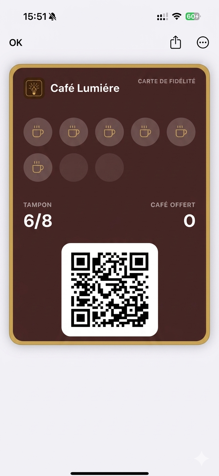
// Coffee cup glyph: cup with steam ticks (used in icon + stamps)
function CoffeeCupGlyph({ size = 22, color = '#a87637' }) {
  return (
    <svg width={size} height={size} viewBox="0 0 28 28" fill="none">
      {/* steam */}
      <path d="M9 4v3" stroke={color} strokeWidth="1.4" strokeLinecap="round"/>
      <path d="M14 3.5v3.5" stroke={color} strokeWidth="1.4" strokeLinecap="round"/>
      <path d="M19 4v3" stroke={color} strokeWidth="1.4" strokeLinecap="round"/>
      {/* cup body */}
      <path
        d="M6 10h13a2 2 0 012 2v0a5 5 0 01-5 5h-7a5 5 0 01-5-5v0a2 2 0 012-2z"
        fill={color}
      />
      {/* handle */}
      <path
        d="M21 11.5h1.5a2 2 0 012 2v0a2 2 0 01-2 2H21"
        stroke={color} strokeWidth="1.6" fill="none" strokeLinecap="round"
      />
      {/* saucer */}
      <rect x="4.5" y="19" width="16" height="1.6" rx="0.8" fill={color}/>
    </svg>
  );
}

// ─── Wallet view — full screenshot from reference ───────────────────────────
function WalletView({ t }) {
  return (
    <div style={{
      position: 'absolute', inset: 0,
      background: '#fff',
      overflow: 'hidden',
    }}>
      <img
        src="assets/wallet-screen.jpg"
        alt=""
        draggable={false}
        style={{
          position: 'absolute', inset: 0,
          width: '100%', height: '100%',
          objectFit: 'cover', objectPosition: 'top center',
          userSelect: 'none', pointerEvents: 'none',
          display: 'block',
        }}
      />
    </div>
  );
}

function LoyaltyCard() {
  const cardW = SCREEN_W - 32;
  const cardX = 16;
  const cardY = 100;
  const cardH = 400;

  // Color tokens lifted from the reference
  const brown    = '#3d2418';
  const brownTop = '#4a2c1c';
  const gold     = '#b88547';
  const goldHi   = '#d6a86b';
  const cream    = '#f6ecdc';

  return (
    <div style={{
      position: 'absolute',
      left: cardX, top: cardY,
      width: cardW, height: cardH,
      borderRadius: 16,
      // Outer gold ring — padding holds the brown card inset by 4px on all sides
      background: `linear-gradient(180deg, ${goldHi} 0%, ${gold} 60%, #946a35 100%)`,
      padding: 4,
      boxSizing: 'border-box',
      boxShadow:
        '0 8px 22px rgba(60, 30, 10, 0.18), ' +
        '0 1px 0 rgba(255, 220, 170, 0.10) inset',
    }}>
      {/* Inner brown card */}
      <div style={{
        width: '100%', height: '100%',
        borderRadius: 12,
        background: `linear-gradient(168deg, ${brownTop} 0%, ${brown} 55%, #2c1a10 100%)`,
        // Second (inner) gold hairline
        boxShadow:
          `inset 0 0 0 1.2px ${gold}, ` +
          'inset 0 1px 0 rgba(255, 220, 170, 0.08)',
        padding: '14px 14px 12px 14px',
        boxSizing: 'border-box',
        position: 'relative',
        overflow: 'hidden',
      }}>
        {/* Header row */}
        <div style={{
          display: 'flex', alignItems: 'center', justifyContent: 'space-between',
          marginBottom: 14,
        }}>
          <div style={{ display: 'flex', alignItems: 'center', gap: 9 }}>
            <div style={{
              width: 30, height: 30, borderRadius: 7,
              background: 'rgba(184, 133, 71, 0.16)',
              display: 'flex', alignItems: 'center', justifyContent: 'center',
              boxShadow: `inset 0 0 0 1px ${gold}`,
            }}>
              <CafeLumiereMark color={goldHi} />
            </div>
            <div style={{
              color: cream,
              fontSize: 15,
              fontWeight: 600,
              letterSpacing: '-0.005em',
            }}>
              Café Lumière
            </div>
          </div>
          <div style={{
            color: 'rgba(246, 236, 220, 0.62)',
            fontSize: 8.5,
            letterSpacing: '0.14em',
            fontWeight: 500,
          }}>
            CARTE DE FIDÉLITÉ
          </div>
        </div>

        {/* Stamp grid 5+3 */}
        <div style={{
          display: 'grid',
          gridTemplateColumns: 'repeat(5, 1fr)',
          gap: 9,
          marginBottom: 16,
        }}>
          {Array.from({ length: 8 }).map((_, i) => (
            <Stamp key={i} filled={i < 6} gold={gold} goldHi={goldHi} />
          ))}
        </div>

        {/* Counters */}
        <div style={{
          display: 'flex', justifyContent: 'space-between',
          marginTop: 8,
        }}>
          <div>
            <div style={{
              color: 'rgba(246, 236, 220, 0.62)',
              fontSize: 9,
              letterSpacing: '0.14em',
              fontWeight: 500,
              marginBottom: 3,
            }}>
              TAMPON
            </div>
            <div style={{
              color: cream,
              fontSize: 30,
              fontWeight: 500,
              letterSpacing: '-0.02em',
              lineHeight: 1,
            }}>
              6/8
            </div>
          </div>
          <div style={{ textAlign: 'right' }}>
            <div style={{
              color: 'rgba(246, 236, 220, 0.62)',
              fontSize: 9,
              letterSpacing: '0.14em',
              fontWeight: 500,
              marginBottom: 3,
            }}>
              CAFÉ OFFERT
            </div>
            <div style={{
              color: cream,
              fontSize: 30,
              fontWeight: 500,
              letterSpacing: '-0.02em',
              lineHeight: 1,
            }}>
              0
            </div>
          </div>
        </div>

        {/* QR code */}
        <div style={{
          position: 'absolute',
          left: '50%', bottom: 14,
          transform: 'translateX(-50%)',
          width: 124, height: 124,
          background: '#fff',
          borderRadius: 6,
          padding: 6,
          boxSizing: 'border-box',
          boxShadow: '0 1px 2px rgba(0,0,0,0.2)',
        }}>
          <QRCode />
        </div>
      </div>
    </div>
  );
}

// Small "C/L" monogram glyph
function CafeLumiereMark({ color = '#c89761' }) {
  return (
    <svg width="16" height="16" viewBox="0 0 20 20" fill="none">
      <path d="M5 5h4M5 5v10h4" stroke={color} strokeWidth="1.6" strokeLinecap="round" fill="none"/>
      <path d="M11 5v10M11 15h4" stroke={color} strokeWidth="1.6" strokeLinecap="round" fill="none"/>
    </svg>
  );
}

function Stamp({ filled, gold = '#b88547', goldHi = '#d6a86b' }) {
  return (
    <div style={{
      aspectRatio: '1 / 1',
      borderRadius: '50%',
      background: filled
        ? 'rgba(184, 133, 71, 0.18)'
        : 'rgba(0, 0, 0, 0.22)',
      boxShadow: filled
        ? `inset 0 0 0 1.2px ${gold}, inset 0 1px 0 rgba(214, 168, 107, 0.18)`
        : 'inset 0 0 0 1px rgba(0, 0, 0, 0.12), inset 0 1px 1px rgba(0,0,0,0.18)',
      display: 'flex', alignItems: 'center', justifyContent: 'center',
    }}>
      {filled && <CoffeeCupGlyph size={26} color={goldHi} />}
    </div>
  );
}

// ─── QR code (deterministic pseudo-random pattern, original) ────────────────
function QRCode() {
  const cells = 21;
  // Pseudo-random but stable pattern via LCG
  const grid = React.useMemo(() => {
    let s = 7;
    const rand = () => {
      s = (s * 9301 + 49297) % 233280;
      return s / 233280;
    };
    const g = [];
    for (let y = 0; y < cells; y++) {
      const row = [];
      for (let x = 0; x < cells; x++) {
        row.push(rand() > 0.5);
      }
      g.push(row);
    }
    // Add finder squares (3 corners): 7x7 with inner pattern
    const stampFinder = (ox, oy) => {
      for (let dy = 0; dy < 7; dy++) {
        for (let dx = 0; dx < 7; dx++) {
          const x = ox + dx, y = oy + dy;
          const inOuter = dx === 0 || dx === 6 || dy === 0 || dy === 6;
          const inInner = dx >= 2 && dx <= 4 && dy >= 2 && dy <= 4;
          g[y][x] = inOuter || inInner;
          // Carve white ring
          if (!inOuter && !inInner) g[y][x] = false;
        }
      }
    };
    stampFinder(0, 0);
    stampFinder(cells - 7, 0);
    stampFinder(0, cells - 7);
    return g;
  }, []);

  return (
    <svg viewBox={`0 0 ${cells} ${cells}`} style={{ display: 'block', width: '100%', height: '100%' }} shapeRendering="crispEdges">
      <rect width={cells} height={cells} fill="#fff" />
      {grid.map((row, y) =>
        row.map((on, x) =>
          on ? <rect key={`${x}-${y}`} x={x} y={y} width="1" height="1" fill="#0a0a0a" /> : null
        )
      )}
    </svg>
  );
}

// Decorative sparkle in lower-right (from references)
function Sparkle() {
  return (
    <svg
      width="28" height="28" viewBox="0 0 28 28"
      style={{ position: 'absolute', right: 46, bottom: 46, opacity: 0.5 }}
    >
      <path
        d="M14 2 L16 12 L26 14 L16 16 L14 26 L12 16 L2 14 L12 12 Z"
        fill="#9aa0a8"
      />
    </svg>
  );
}

// ─── Mount ──────────────────────────────────────────────────────────────────
function App() {
  return (
    <Stage
      width={W}
      height={H}
      duration={DURATION}
      background="#efeae2"
      persistKey="walletpass"
    >
      <Scene />
    </Stage>
  );
}

const root = ReactDOM.createRoot(document.getElementById('root'));
root.render(<App />);
